BASIC Principles
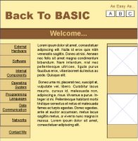
Below are my two 'thumbnail' ideas. Because they're 'thumbnails', they're nothing special, and are by no means finished or even correctly proportioned. But they do give a rough idea of what my final designs will look like. Any feedback on which is the preferential idea, why it is, or why it isn't, or even just what you like and dislike about each idea would be greatly received.
Option 1 
Option 2
6 comments:
The thing I dislike mainly is the colour scheme. Even though they are quite warm colours, I'm not seeing that and the just look dank and muddy.
Also, the two designs aren't exactly poles apart from each other. Did you not have any radically different designs you could go with too?
I started off with 11 thumbnails, of which I chose my favourite 6 (all slightly diff) I then used feedback to decide on which where the best two (although quite similar) and ended up with these two.
Steve has commented that we need to start 'thinking outside the box' for the web sites, although I did try to keep the designs fairly simple for novice users to use.
Do you have any suggestions for different colours Craig? I know you mentioned warm colours, so do you think I should stick with them, or perhaps go for more cooler blues or even more brighter, hotter, reds?
I mentioned on Chris Towell's blog that colour is going to be really important to this porject as the audience is broader than the last project. Hot reds can be aggressive while cooler blues can seem 'techy' and may put some novices off.
Its going to be a tricky one I think.
A good way to gain a nice standard colour throughout that will match any pictures logos you have is this method as explained on this website.
http://www.mezzoblue.com/archives/2004/05/14/colour_schem/
Taking samples (which photoshop can do) from an image is a good way to create unique colours for yourself.
Whatever picture you use will determine the feel of the design.
Quite a good idea Dean. And thanks for the website. I'll check it out soon.
Colour aside for the time being, what do other people think about the actual designs? Obviously colour will play a big part, but anything else anyone really hates/loves about them bearing in mind the target audiences?
I prefer the top design myself, craig. I think having the navigation, body text and images all in the same area is better proportioned than having the navigation above the body text and pictures.
Just my opinion though, what does anyone else think?
Post a Comment